Not just a UI kit, a better workflow
In a time before slots existed, what began as a vision to bridge the gap between design artefact creation and content publishing gradually evolved into an entirely new way of working.
By uniting not just front-end UI but the entire creation process, the kit introduced a drag-and-drop, one-component-fits-all approach.
And somewhere along the way, a simultaneous dual-breakpoint workflow emerged: design once, generate all outputs—no extra effort required.
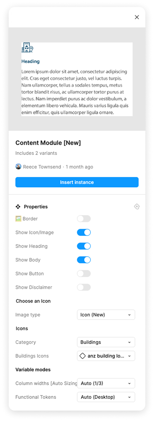
Drop Anywhere,
Fit Everywhere
To eliminate the need for duplicate components tailored to specific sizes, placements, or breakpoints, components have been designed to be fully adaptable, allowing them to be seamlessly dropped into any column configuration and automatically adjust to fit.

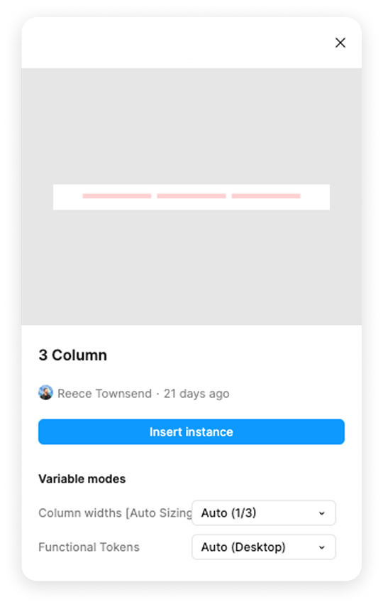

Adaptive column containers
Preconfigured column containers enable fast, efficient page builds by leveraging responsive tokens. This ensures that designs automatically adapt across desktop, mobile, and everything in between, mirroring real-world responsiveness as they would in production.
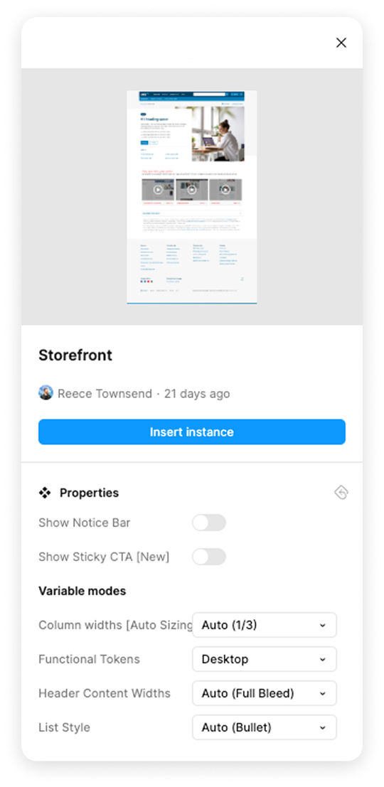
Page frameworks
Why waste time copying old files or repeatedly setting up the same headers and footers? Page frameworks offer a smart, consistent starting point for any page type, streamlining setup and ensuring design alignment from the start.

Simple. Smart. Fast.
With the flexibility to drag any component into any column, the kit eliminates duplication of effort, streamlining both the design process and the hunt for the right element. No more second-guessing layouts or rebuilding pieces from scratch. Just grab, drop, and move on. It’s design with momentum.